Overview
This was a fictional school project where we were given the task of adapting the accessibility of the existing website Halland Society for Nature Conservation (Naturskyddsföreningen Halland).
The purpose of the project was to make an accessibility adjustment with restrictions to change design elements with the help of the WCAG guidelines and to use accessibility tools where we can familiarize ourselves with how people with difficulties can perceive the website.
We did a process with user research, accessibility reviews with help of different tools and Web Content Accessibility Guidelines (WCAG) and analysis which resulted in the identification of accessibility problems and suggestions for improvement.
Customer
Fictional project
Period of time
April 2021 (One week)
Team
Four UX Designers
The website
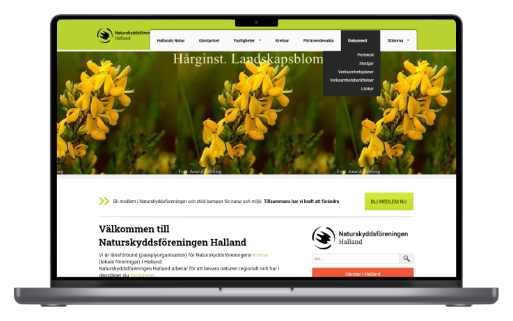
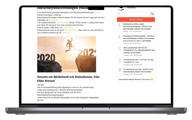
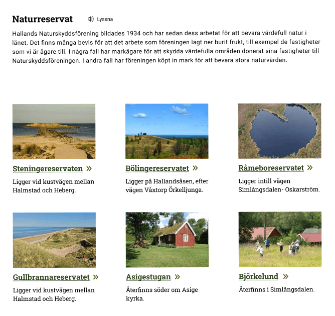
Halland Society for Nature Conservation's website before accessibility adaptation and redesign was done.
Analyze current design
Accessibility tools
We started with an initial research by analyzing the availability of the website using the tools Lighthouse and Wave evaluation tool.
We also used the tools Funkify, Silktide, Web Disability Simulator to see what difficulties there are and how people with example parkinson syndrome, tunnel vision, dyslexia etc experience the website. This helped us in how we can adapt the accessibility of the website according to difficulties and needs.
The light green text is perceived as unclear, difficult to read and is not perceived as clickable
Usability tests
Accessibility review (WCAG)
Insights from the tests
Accessibility tools and WCAG
The website has flaws and does not meet the WCAG standard A or AA on parts of the website. Among other things, it is about contrasts, navigation, Pointer cancellation, etc.
The accessibility tools show that the website lack of contrast for persons with color, blindness or visual impairment, there are too small click areas, uneven text breaks and small text, lack of translation and other options such as sign language etc.
Usability tests
The usability tests gave us a deeper understanding of the accessibility issues that existed on the site.
Age and vision defects
The light green text is perceived as unclear, difficult to read and is not perceived as clickable
In the calendar, there are whole sentences with uppercase letters that are perceived as annoying and difficult to read
Experiences that the size of the various categories is small and that the subcategories are perceived as difficult to read due to placement
Red and green color blindness
The green color of the links is perceived as faint, but I think it looks green
Feels that the images at the top of the pages are strange as the text size, colors and placement are different on the images on the pages
The content of the protocol page is unclear because the text has a light green color
Physical limitations
Difficult to sit up for a long time and because the website contains a lot of information, it may need to change from sitting to lying position to relieve the back
Feels limited to the website that lacks an easy way of reading content
Dyslexia
The text in the calendar is written in bold and is perceived as difficult because the letters are too close to each other, which makes it difficult to distinguish
The green text links are perceived as unclear, difficult to read and blend into the white background
Text on images is very unclear and needs more contrast to make the text clearer
Vision defect
Feels that the text is difficult to read because the text is small and that the text breaks lead to it having to read the sentences again to take in the content
Frustrated with the content because the width of the different pieces of text are not symmetrical in relation to each other
Whole sentences in capital letters are perceived as annoying and difficult to read
Improvement suggestions
Use larger text for clarity and readability
Create a better structure on text in the form of headings and body
Simplify and structure the menu
Use descriptive texts for media and images
Replace / delete images that aren't relevant
Change the colors of links, buttons, menus, etc. due to contrast
Reposition the calendar and make it clearer
Make links clearer
Restructure links in a more appealing way by, for example, using icons
Add functions for people with difficulties ex. listen, translate
Add breadcrumbs to the page
Remove unnecessary / use white space on the pages of the website
Contrast on "back to top" in footer
Design and solutions
Structure
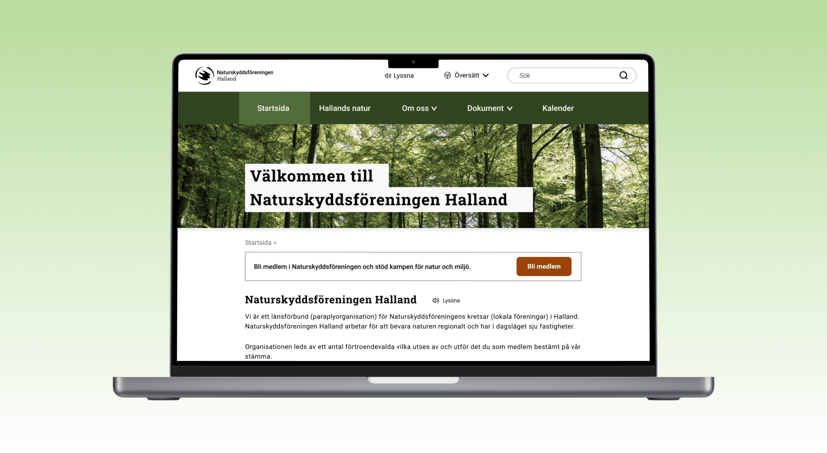
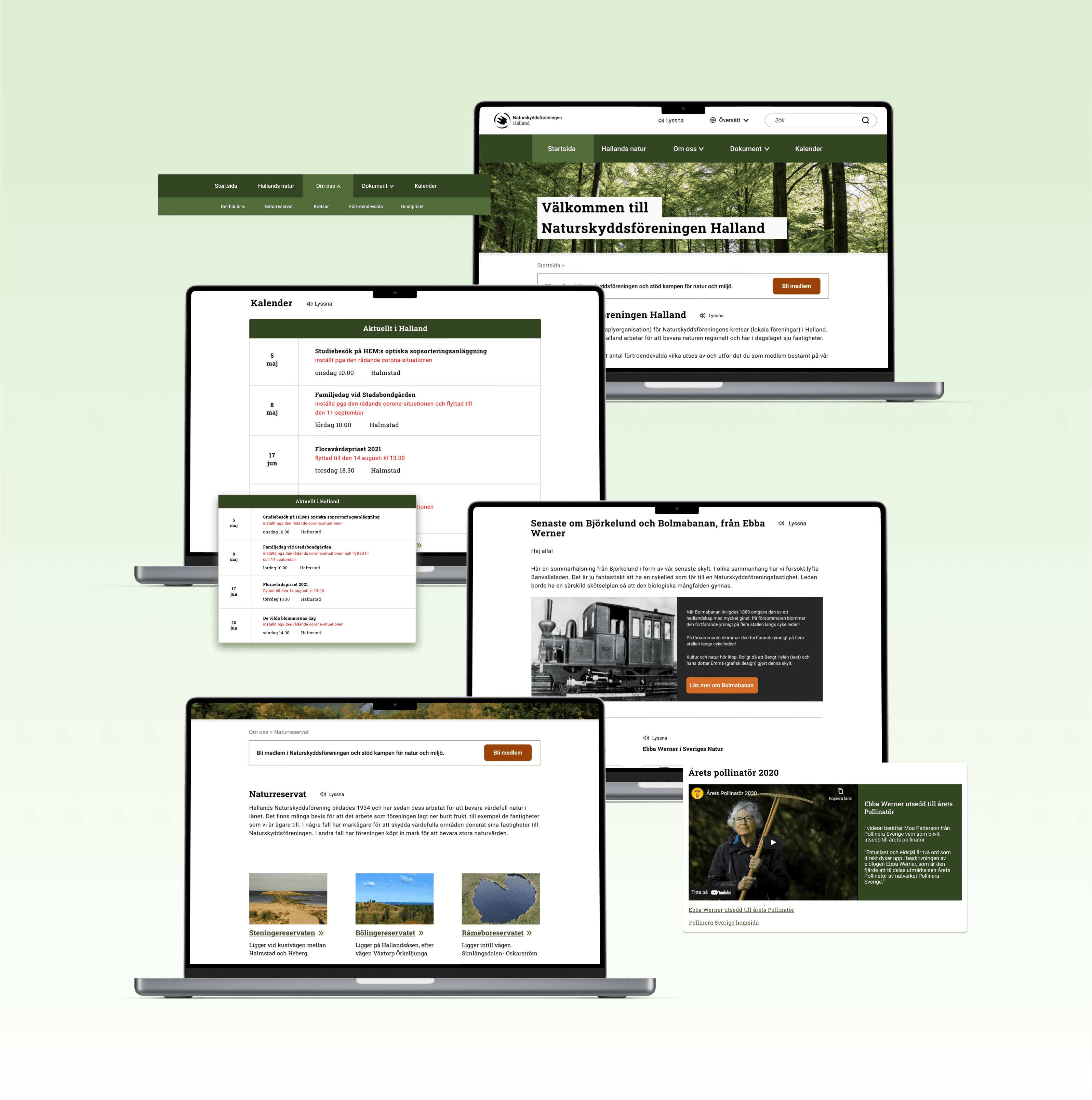
The website was reorganized to follow the conventional rules that exist for, among other things, navigation and placement of components. Among other things, airier, clear links, relevant and represented images, shorter but more informative texts and headings, etc. were made.
* The picture shows an example of structure that was made
Colors and contrasts
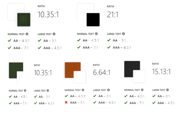
We chose to improve the page's colors so that they would achieve a sufficiently good contrast according to WCAG. WCAG 1.4.3 Contrast (minimum) (AA) for background and text color to be on top.
Most requirements are met with the colors selected. Most importantly, it meets the contrast ratio of at least 4:5 and 3:1 depending on the text. Where it falls on the contrast, the font size has been increased so that it exceeds, for example, 16 pixels or 18 pixels so that it is approved.
Typography
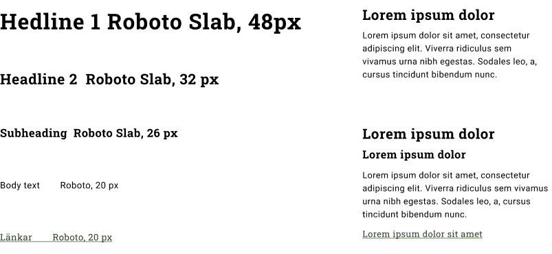
The typography has been improved in the form of font sizes, line spacing, distance between paragraphs, etc. because according to WCAG 1.4.12 it is important to have a certain line spacing, distance between paragraphs, letter spacing and line spacing in relation to the font size.
The font size has been increased and thus makes it more accessible for users with poor eyesight or have difficulty reading the texts due to, for example, dyslexia.
Images and videos
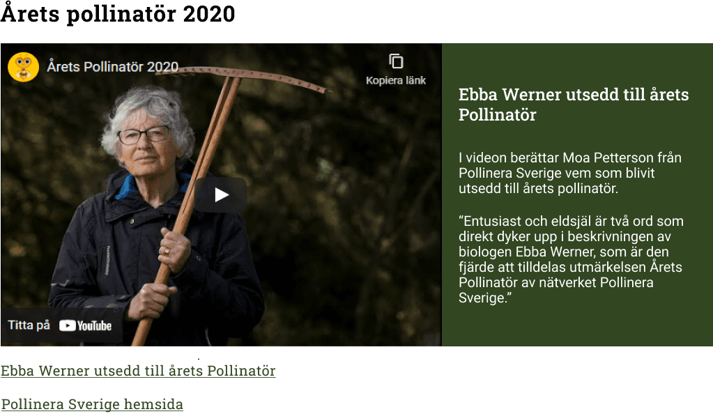
Users with reading difficulties or deafness may perceive media as non-speaking and according to the WCAG guidelines in section 1.2.3 believe that it is important to describe what videos are about.
Therefore, more descriptive texts have been made for these elements so that users with these disabilities have the opportunity to understand or be able to read the information.
Navigation menu and top menu
Users must click on the menu items to bring up a drop-down menu that then appears when they click on the selected menu item due to WCAG 2.5.2 Pointer Cancellation (A).
The website then used a drop-down menu when hovering over the menu selection, this has now been changed to a fixed drop down and makes it easier for users who are older and may not be stable at the touch of a button.
The navigation menu is moved down because to have space with the important functions listen, translate and a larger search function at the top.
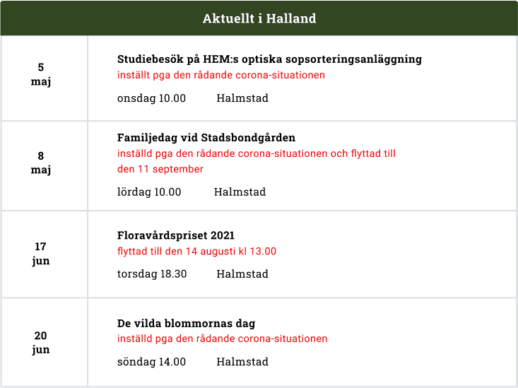
The calendrar
The calendar that is displayed constantly between each page, the usability tests showed that is was hard to see what the calendar contained due to small text, capitals and poor contrast. But also people with concentration difficulties may find it disturbing when they have to read it.
Therefore, we chose to move the calendar to its own page that is clearly visible in the navigation menu. On the page where the calendar is located, we generally made it larger, including the texts. We avoided and even removed the use of capital letters.
Result
My takeaways
During this project, I learned an incredible amount about accessibility, disability and difficulties as well as WCAG guidelines. I will always think about accessibility when it comes to UX Design because it is so important to include all people and an included design. I have had to challenge my own prejudices and perspectives and get to know users who have difficulties.
A challenge during this project was to find representative users and to be able to get a variety of users and then a variety of disabilities. It has also been a challenge to get acquainted with WCAG, which can sometimes be difficult to interpret, but also that there are many guidelines to adhere to.
This was a team work and based on that I have learned more about collaboration. A big point in our collaboration where good communication, sensitivity and commitment.
Want to know more details about this project? Feel free to contact me!
emma00valfridsson@gmail.com
Gothenburg, Sweden
