Overview
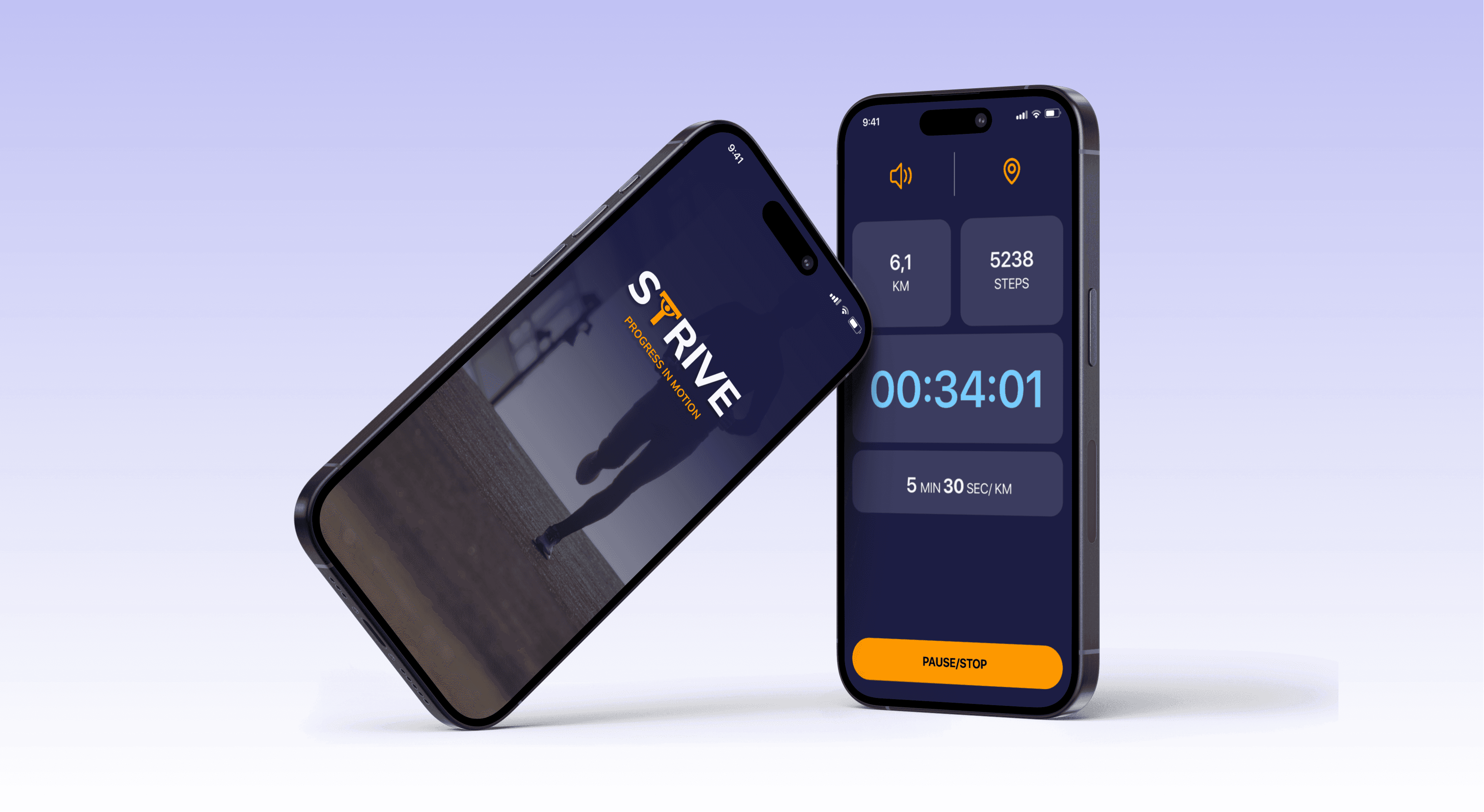
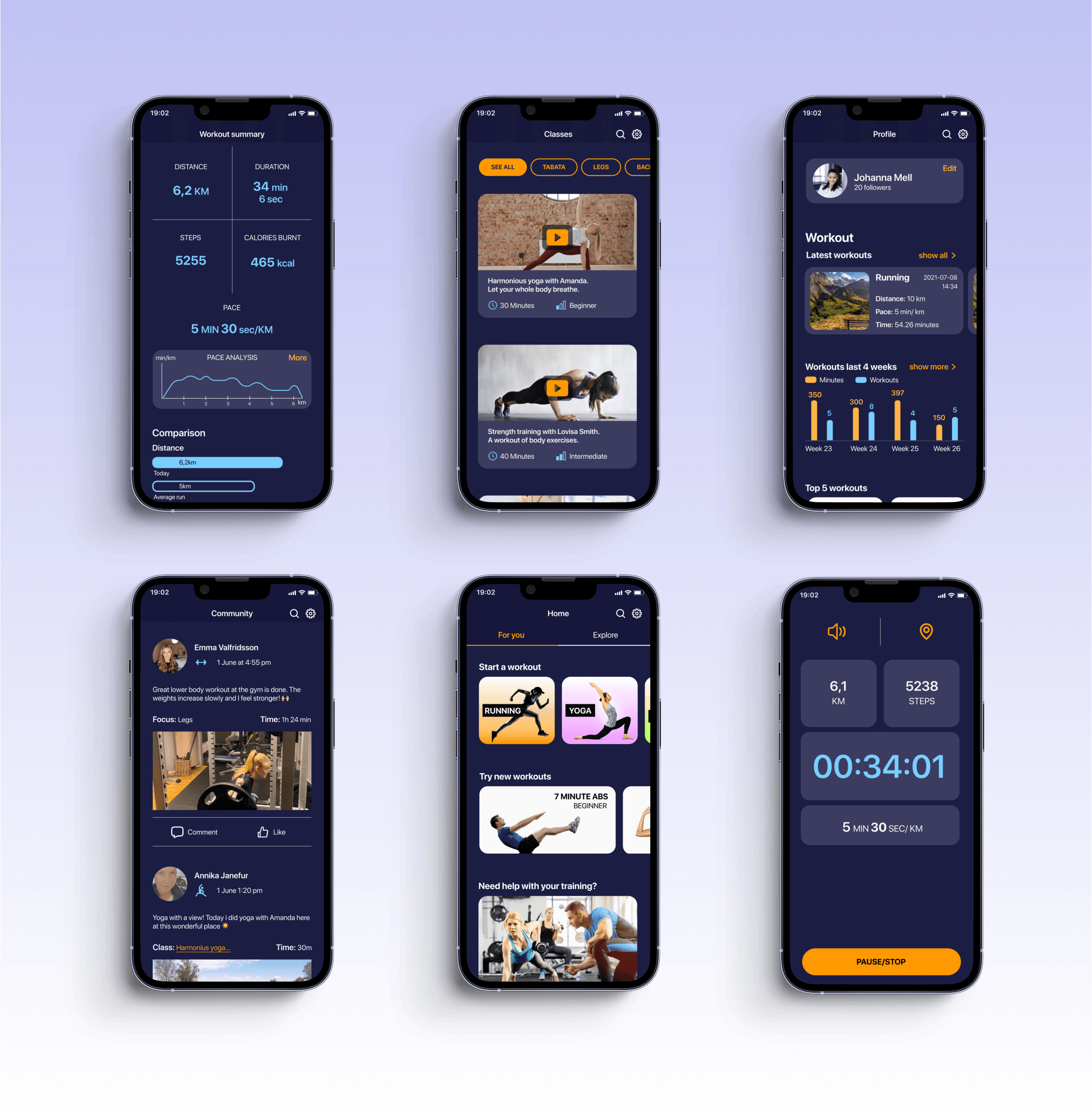
Strive was a fictional school project where we would design an exercise app where we did a design that followed the guidelines for Human Interface Guidelines (IOS) or Material Design (Android). We wanted to learn the similarities and differences between the different operating systems.
The work has included research, flowcharts,wireframing, protoyping, create design system , usability testing and UI Design.
Customer
Fictional project
Period of time
May/June 2021 (2 weeks)
Team
Four UX Designers
Goal and challenge
How can we make Strive adapted for both iOS and Android and how should we do to create an application that is more general about different forms of training, show relevant statics and interact information about competitions and other similar information?
Target group
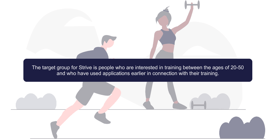
The target group for Strive is people who are interested in training between the ages of 20-50 and who have used applications earlier in connection with their training.
Research
User research
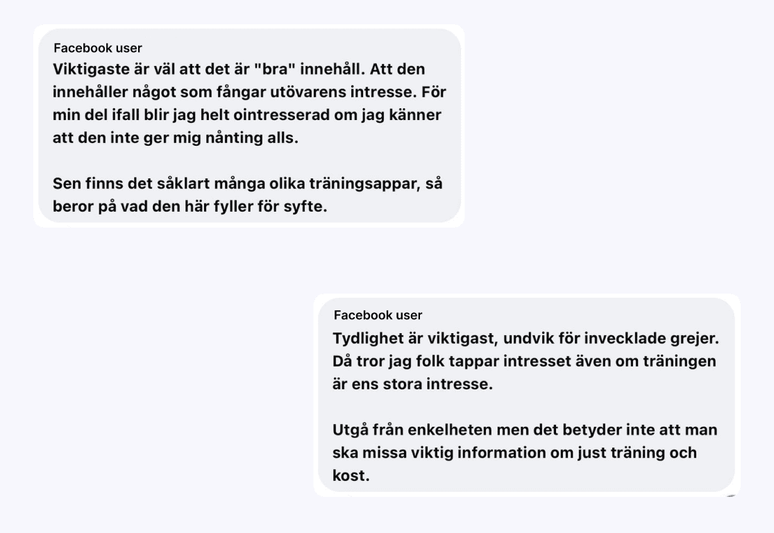
We did a smaller research where we asked people in the target group which training apps they use today, why they use that particular app, what they lack, etc. This is to understand the target group's use of training apps.
I did this in a facebook group for people that where intrested in exercise and health.
Operating system and market review
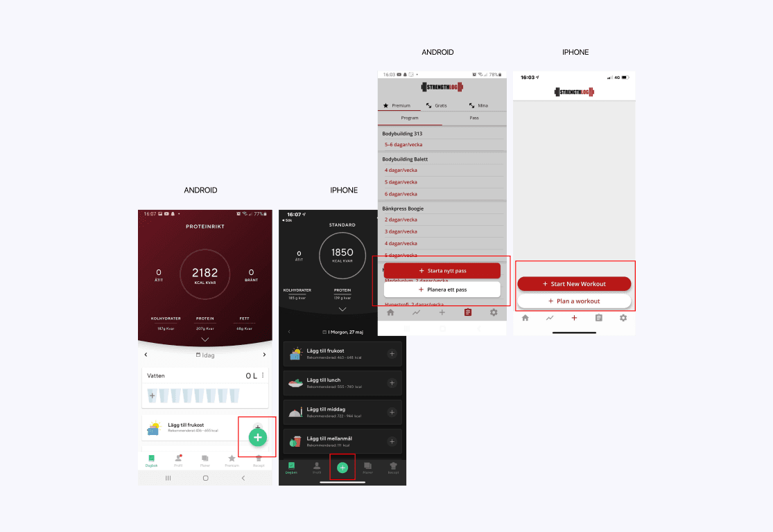
We made a market and operating system comparison to get an idea and understood how Android and iOS usually look in different contexts. Material design and Human interface design guidelines were very helpful in understanding the different operating systems.
In order to further understand the operating systems but also how other applications are structured, a review of existing applications was made.
Insights
Insight 1
People need to have different apps for different training activities, e.g. one for training videos, one for recording running, one for tabata, etc.
Insight 2
Many training apps have a lot of focus on physical health (e.g. kcal, speed etc) Missing app with a focus on mental health linked to exercise.
Insight 3
There is a lack of forums with a focus on specific events (e.g. different races), to share experiences, training plans, encourage each other, etc.
Operating system differences
Buttons (FAB, corner radius, text etc.)
Icons
Typographic (Font family, sentence case etc.)
Cards
Navigation bars
Animations and behaviors
Market review
Training apps comes in both light mode and dark mode
Training apps are usually focused on a specific form of exercise
Exercise apps are available in different layouts (modulated in cards or with dividers etc.)
Understand content and flow
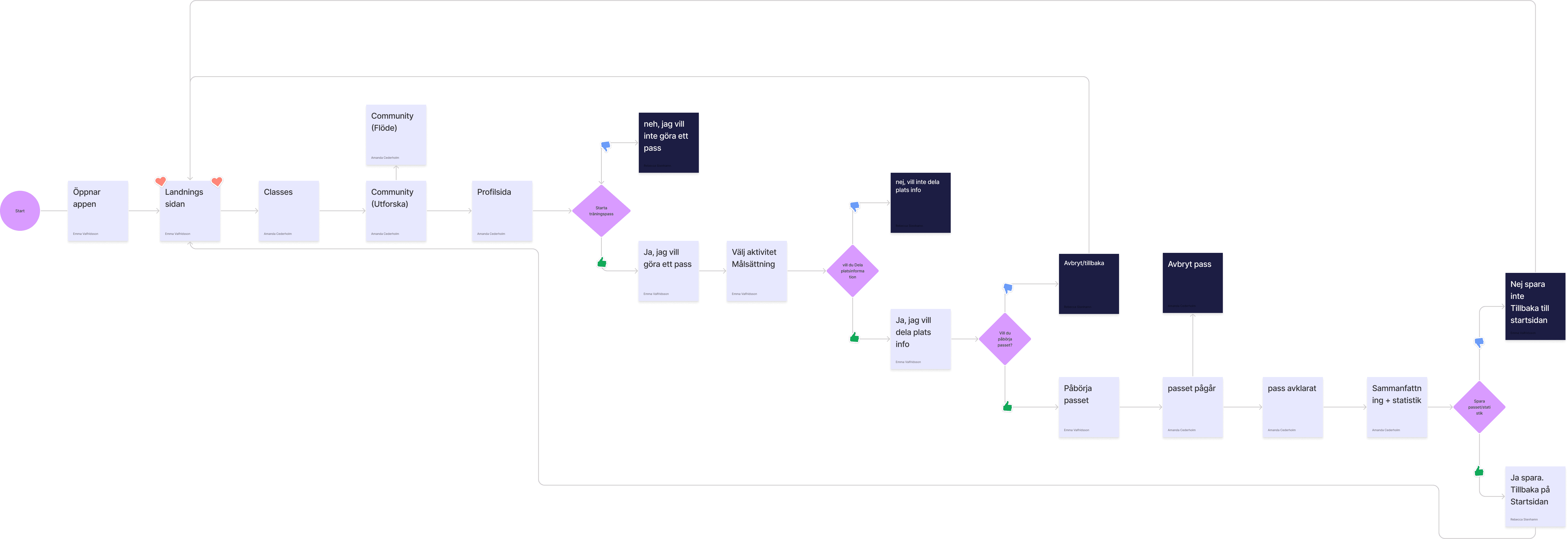
Flowchart
Flowchart was made to structure and see how a user would navigate through the application flow. Because the project and the course's focus was on adapting it to iOS and Android, no different flows were made.
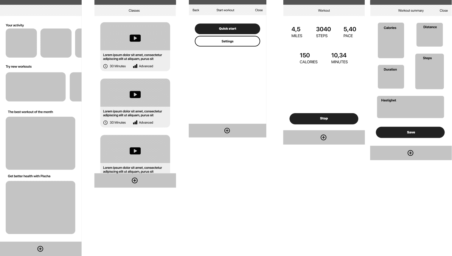
Wireframes
Low/ medium fidelity wireframes were created to see how the layout of each and how the different elements would be and look in the screen. Wireframes were created for both iOS and Android to already see in this step what differences and similarities there were in those different operating systems.
Usability testning
Moderate usability tests were performed on the iPhone prototype, which ended with some questions about the experience. Since the focus of the tests was mainly on functionality, we considered that it did not matter much if the test persons had an iPhone or Android. If we had continued the development of the application, it would have been good to supplement with tests for Android users.
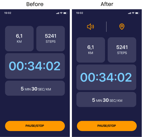
Difficult to click on settings
"It's stupid not to just have a speaker on the front. For example, that you can be a workout assistant: Speaker (mute / unmute)"
In one of the usability tests, the test person found it difficult to click on settings during the current session to turn on the speaker. Therefore, a design decision was made to add a speaker as well as location settings so that the user can more easily access the primary choices during their training.
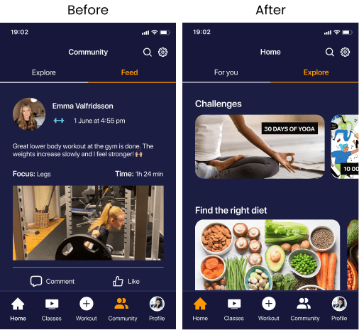
The navigation felt unclear
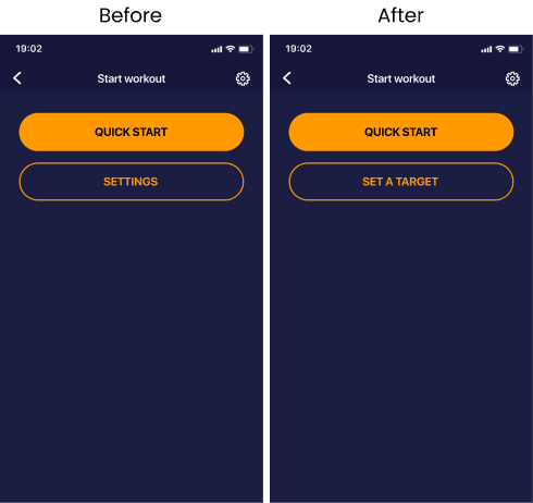
Unclear buttons
Test person was confused during the user test by unclear buttons. The test person thought that the settings button was settings for the passport they had chosen.
A design decision was made that the button's name should be changed to set a target because the user should understand that this is where you can adapt your goals with the training
Differences in the prototype
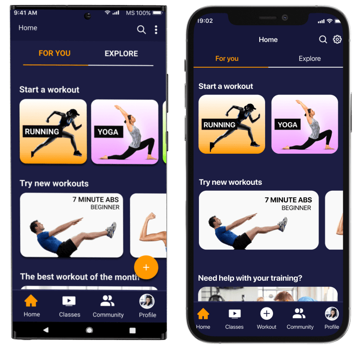
Android / Material design uses the FAB (Floating action button) which is the primary button used while on the IOS / Human Interface Guidelines it is placed in the navigation bar.
They use different fonts, Roboto for Android and San Francisco for iOS. It has also differed in how certain icons look and behave when you click on them.
Something that has been a challenge for us was when it comes to what the animations of the different operating systems look like. We saw that buttons and modules float smartly animated on the screen on Android while iOS has more of a constant or desolve mode that emerges.
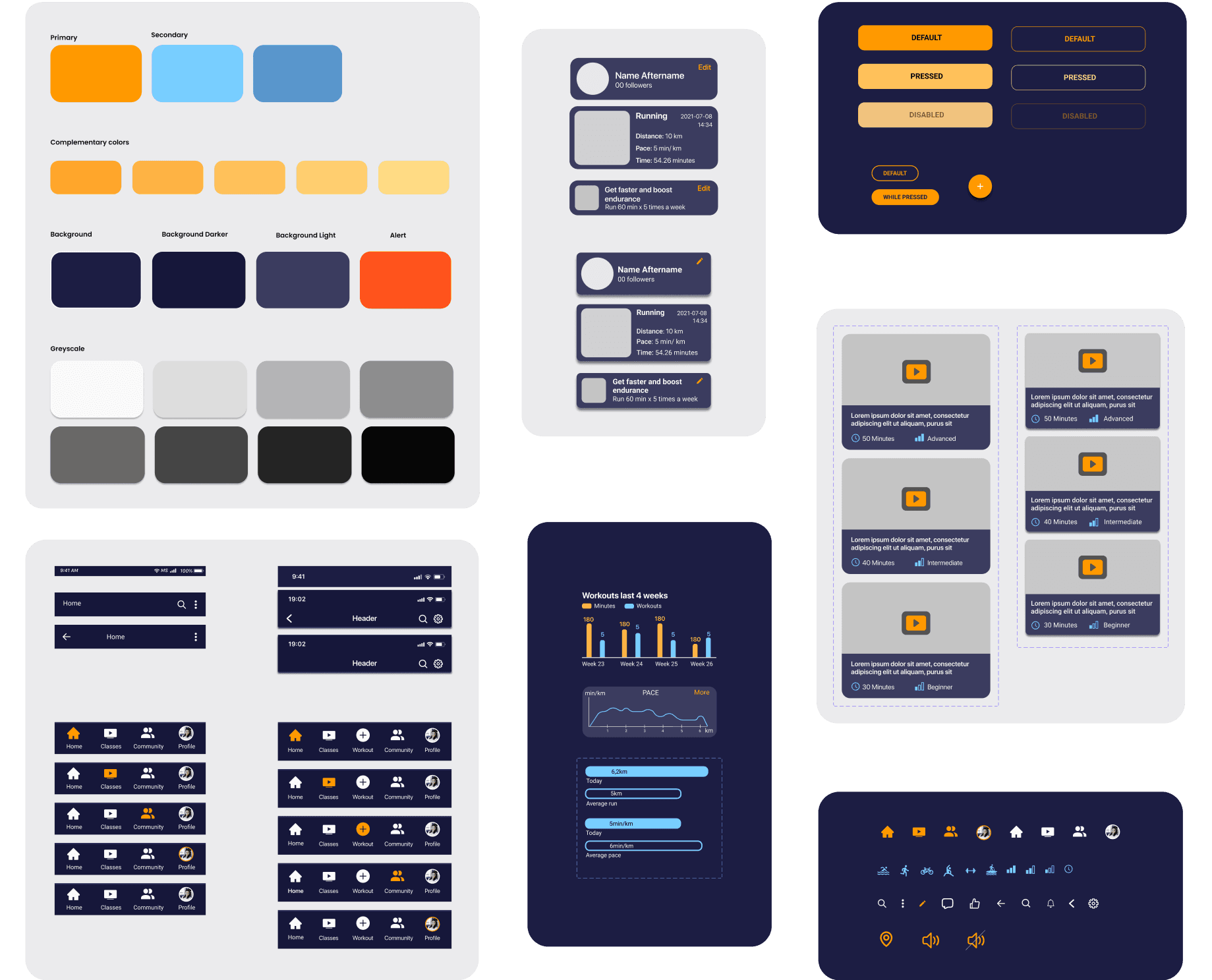
Styleguide and designsystem
Result
My takeaways
During this project, I learned about the various operating system guidelines from the Human Interface Guidelines and Material Design. I thought it was interesting to read and learn more about how these two differ and what you have to keep in mind when designing and what animations are used.
What I will take with me from this project is to decide which operating system you will launch an application with to be able to meet the operating system's guidelines but also how to think and design for dark mode.
Want to know more details about this project? Feel free to contact me!
emma00valfridsson@gmail.com
Gothenburg, Sweden
