Data visualization in a white label forecasting tool

Data visualization in a white label forecasting tool

Overview

What type of product

Foreteller is a white label forecasting tool (Saas) for banks and real estate, serving private individuals. Its core purpose is to provide users, especially homebuyers, with a user-friendly and educational financial decision-making platform.

My task

Investigate and enhance the user experience with Foreteller's results page and data visualization, a project central to my 2022 school thesis.

The final result

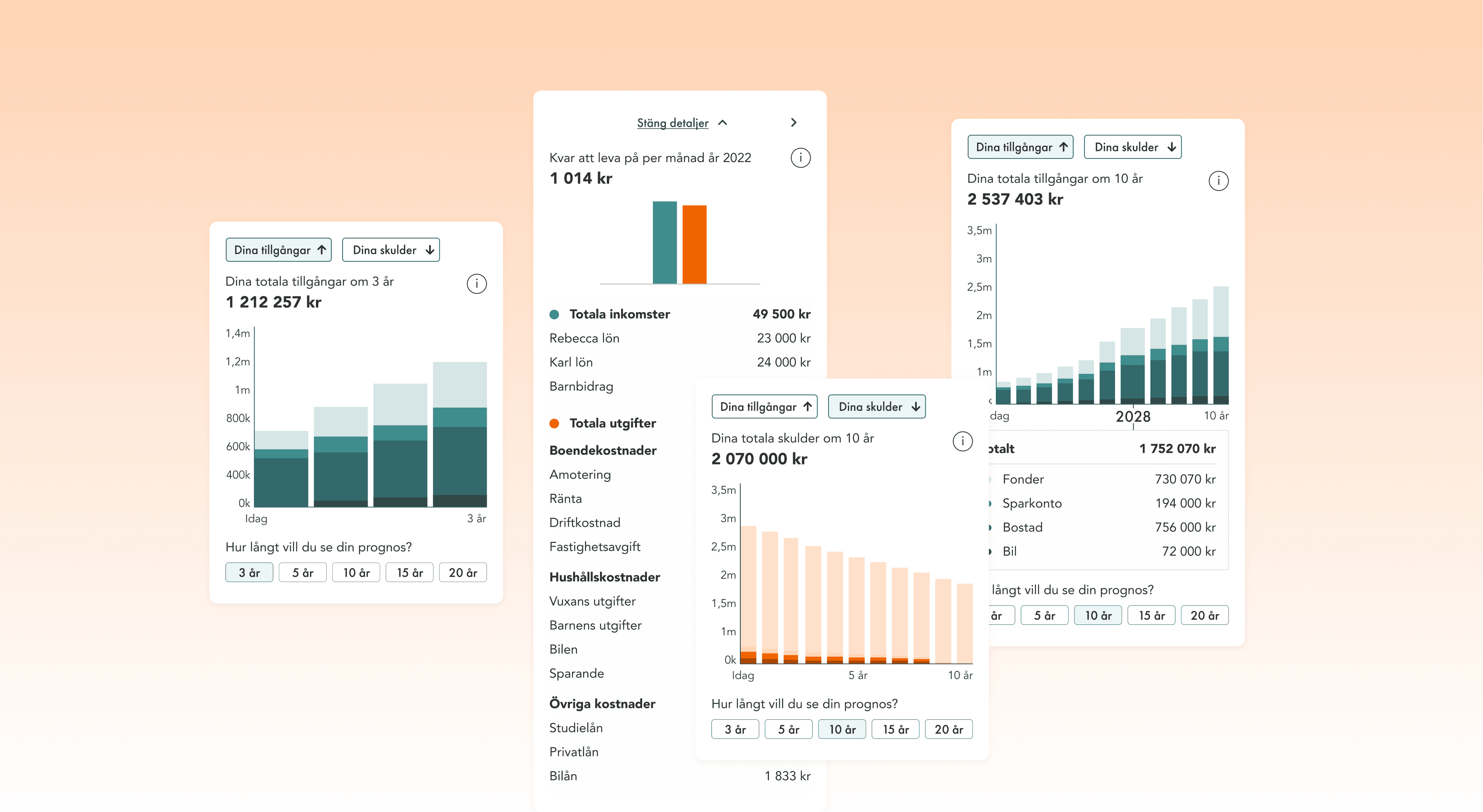
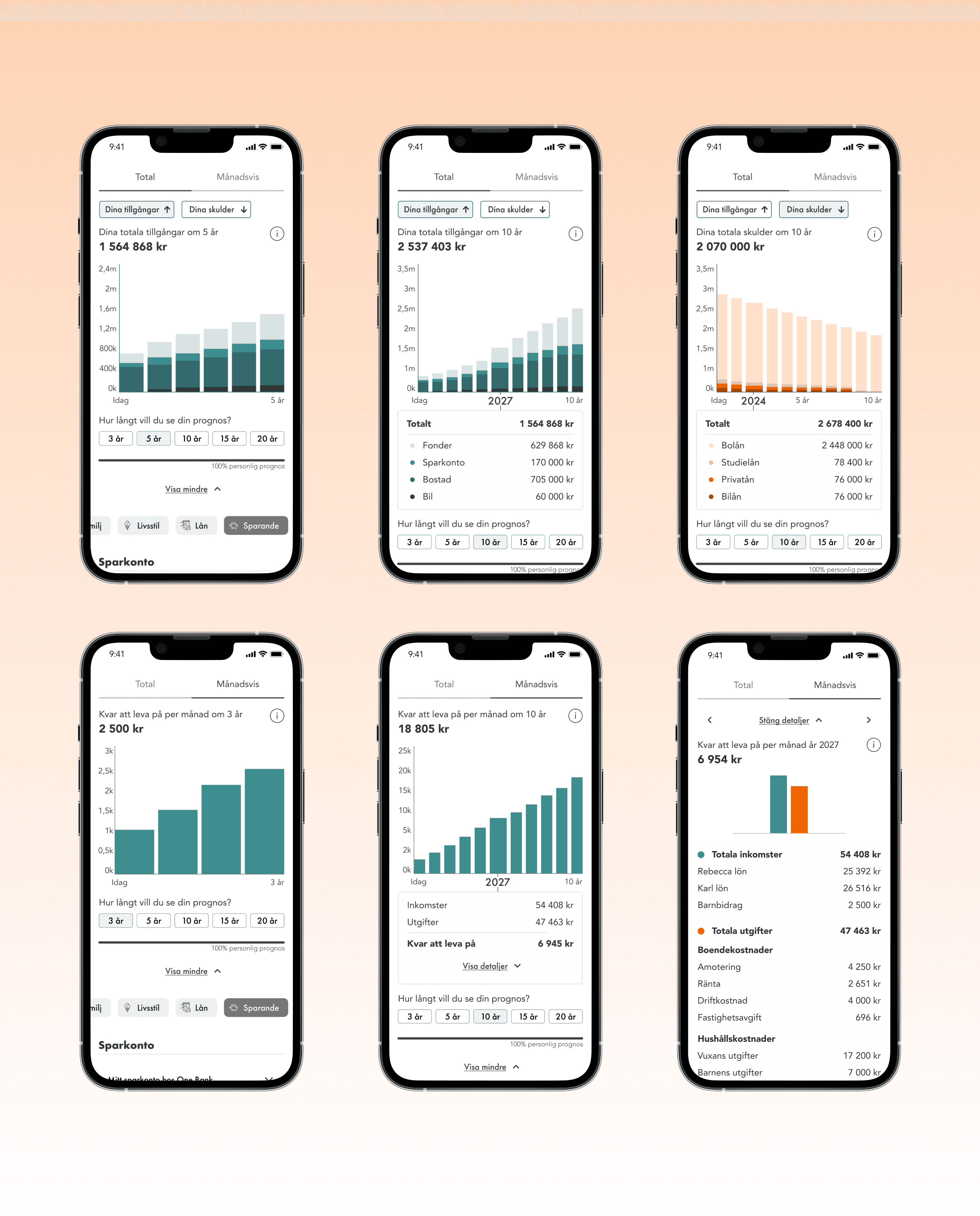
Leveraging interviews and usability testing, I redesigned the existing result. An interactive bar chart combined with a detailed financial table, offering users a holistic view of their economic conditions.

Customer

Econans

Period of time

Jan-May 2022

20% pace

Team

Solo project

Why It Matters - Existing results page and data visualization

  • Foreteller's data visualization and results page lacked sufficient user feedback, making it unclear how well users understood the displayed results.


  • Econans wanted to improve its product by better understanding how users currently experience and comprehend it, with a focus on enhancing the results page and content.


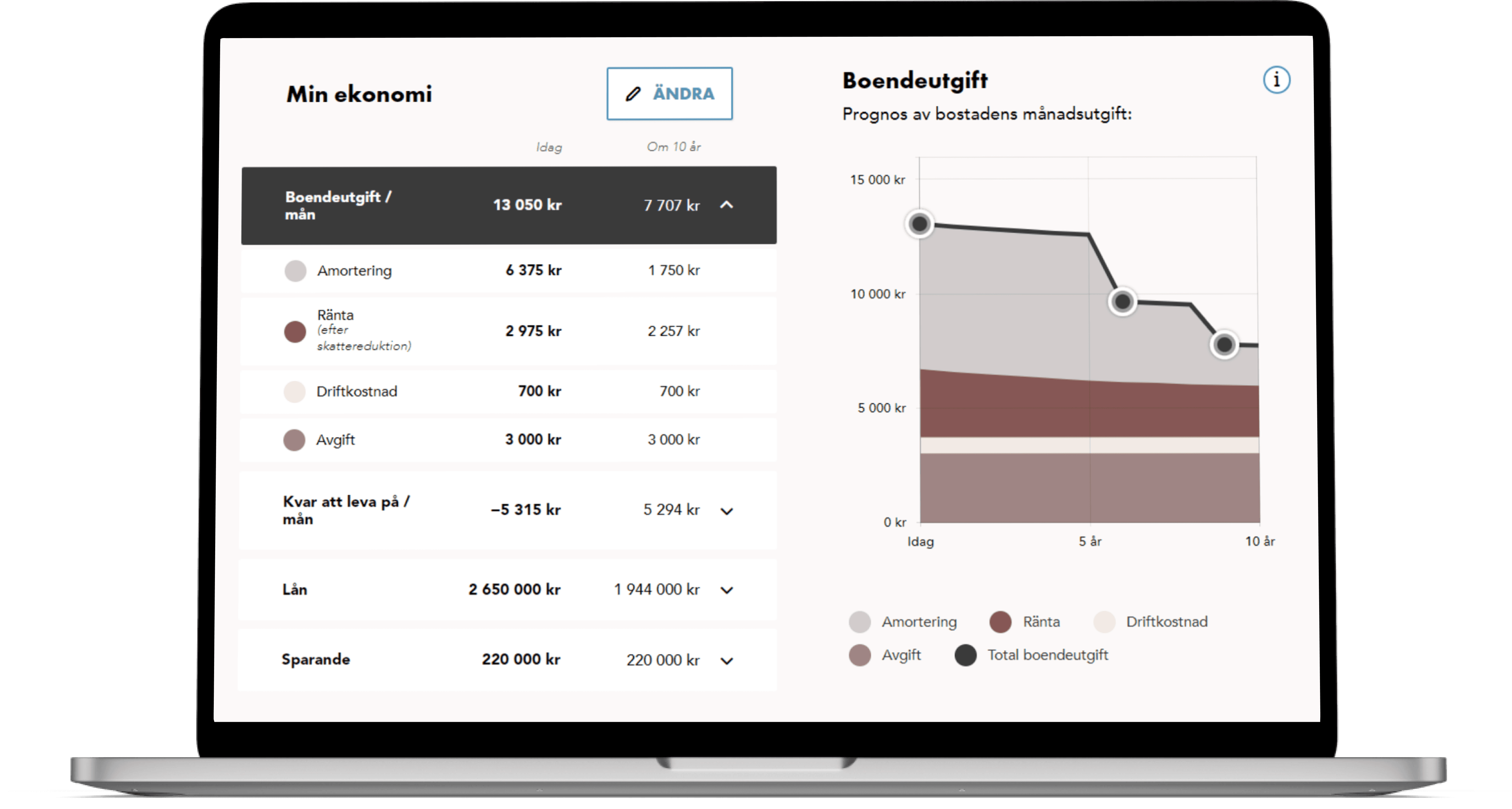
  • Today's results page features separate tables and area diagrams for data visualization.

Design process

Research

User research

Usability testing on exsisting design

Secondary research

Research, Usability testing on exsisting design, Secondary research

Analysis

Thematic analysis

Behavior types

Emapthy mapping

User statements

Thematic analysis, Behavior types, Emapthy mapping, User statements

Ideate

Mindmap barinstorming

Sketching

Low/medium fidelity prototype

Mindmap barinstorming, Sketching, Low/medium fidelity prototype

Validation

Usability test for evaluation

Feedback from UX

Usability test for evaluation, Feedback from UX Lead

Design

High fidelity prototype

UI Design

High fidelity prototype, UI Design

Research

User interviews and usability testing on exsisting design

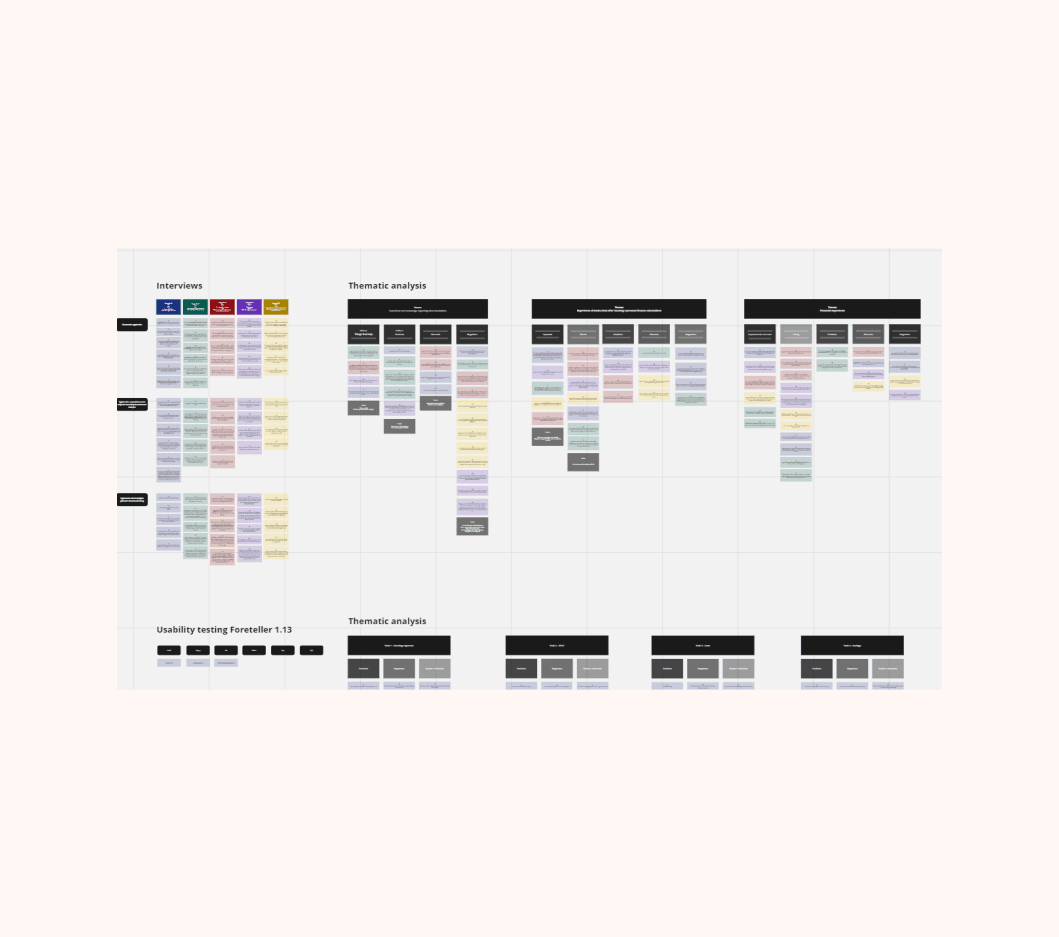
  • Conducted interviews and usability tests to understand user views on personal finances, tool usage, graph experience, and the existing results page and data visualization.


  • Analyzed the collected data thematically.


  • Grouped data into main themes: financial experience and experiences with banks offering housing/personal finance calculations.


  • Further categorized into sub-themes, addressing importance, positives, needs, and helpful aspects.

  • Our brains find patterns faster and can gain a better understanding with the help of data visualization

  • It is important that the data visualizations are adapted from the user who is to view the information and what they want to see

  • People encounter different types of tables daily

  • Some of the most common diagrams are bar, line and pie charts.

Secondary research

  • A smaller secondary research was conducted to gain an own understanding and knowledge of data visualization.


  • What I was looking for was information about what people's integration with data visualization looked like and what to consider when it comes to data visualization.

  • A smaller secondary research was conducted to gain an own understanding and knowledge of data visualization.


  • What I was looking for was information about what people's integration with data visualization looked like and what to consider when it comes to data visualization.

  • A smaller secondary research was conducted to gain an own understanding and knowledge of data visualization.


  • What I was looking for was information about what people's integration with data visualization looked like and what to consider when it comes to data visualization.

Analysis

Behavior types

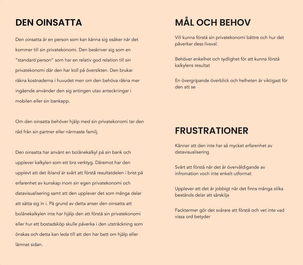
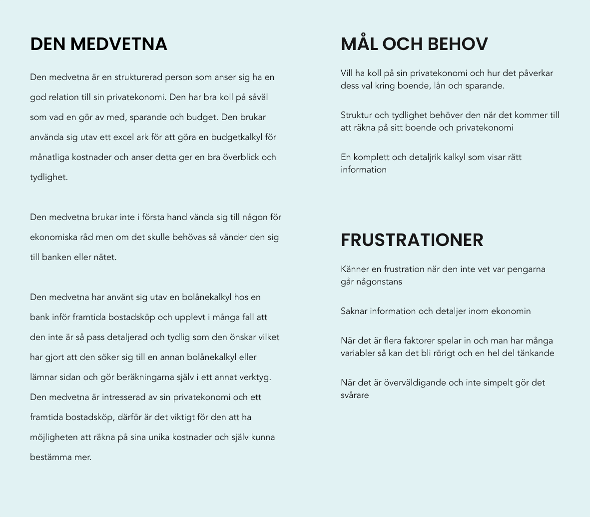
Using the knowledge from the qualitative data, I created two behavior types that capture and represent the users behavior patterns as well as their goals, needs and frustrations connected to personal finances and data visualization in the product.

Empathy map

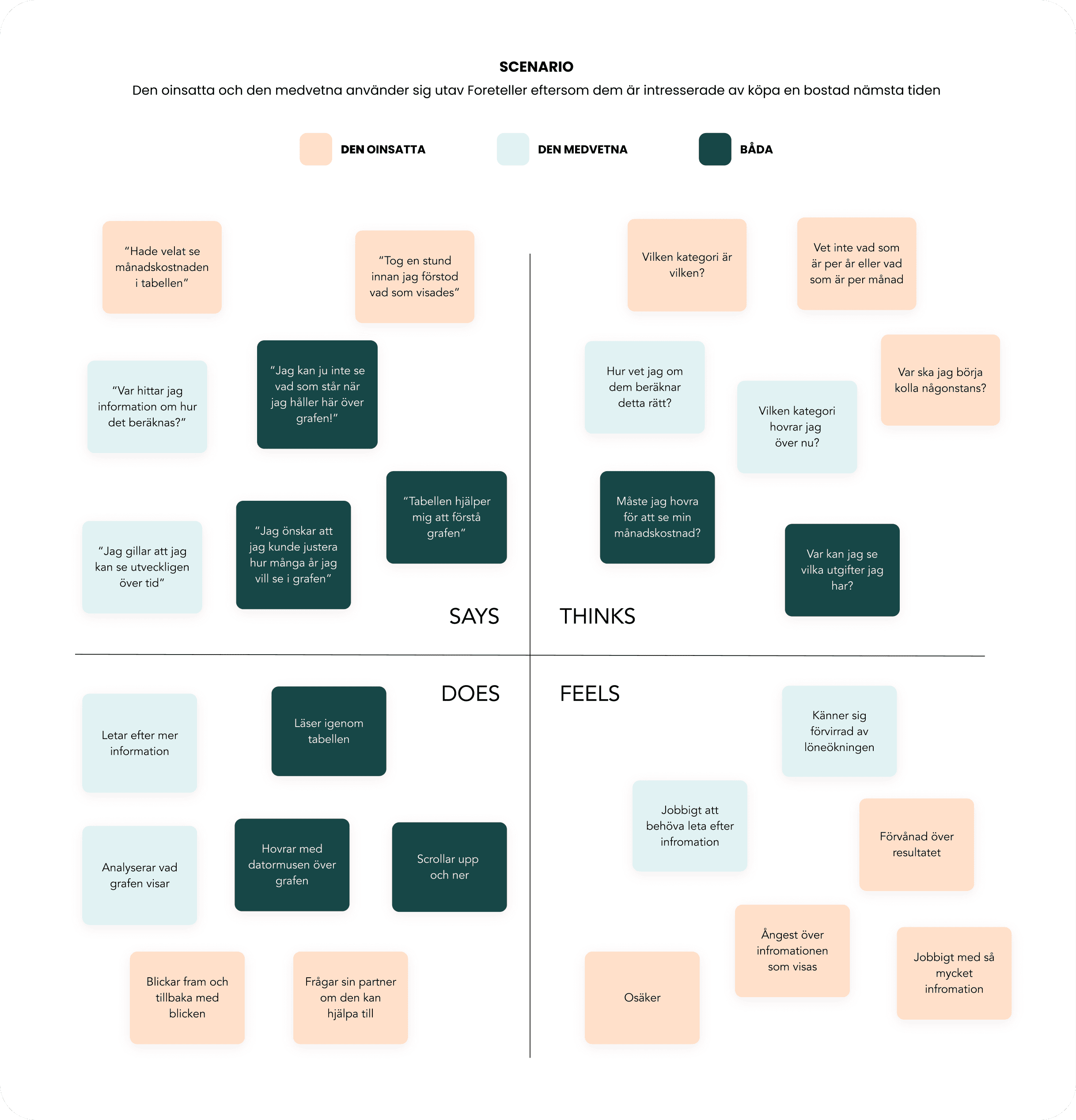
I then created an empathy map based on the qualitative data, the map depicted their thoughts and feelings when using the Foretellers exsisting results page and data visualization.


Scenario
The uninitiated and the conscious use Foreteller because they are interested in buying a home in the near future

User need statements

With the analysis and help of behavior types and empathy mapping, user needs statements were created. I created these to to further define the insights and develop concrete starting points. These statements made it easier to understand the challenge and made it possible to define what is to be solved before starting to look for solutions.

The uninitiated

The uninitiated who do not always have such a careful control of their personal finances need a simple and clear result that provides a good overview so that they can more easily understand their personal finances and how it can affect their life choices in the future.

Research, Usability testing on exsisting design, Secondary research

The conscious

The conscious who is structured and careful needs a well-informed with both an overall picture and a more detailed result because he wants to keep track of his costs and how those different parts such as housing, loans and savings affect each other before future home purchases.

Thematic analysis, Behavior types, Emapthy mapping, User statements

Ideate

Adaptation to the new design framework

Furthermore, there were certain approaches to consider. The product Foreteller, which is already in the development phase, has been given a new design framework and structure from the design team, which means that the ideas and sketches that are developed must be based on certain guidelines.


In Foreteller 2.0, the result part should be at the top of the flow but which is dynamic, i.e. can become larger and smaller. Since the result part is in one and the same place in the flow, this means that the area for data visualization is becoming smaller and more complex in how to utilize the area that exists.

Brainstorming mind map

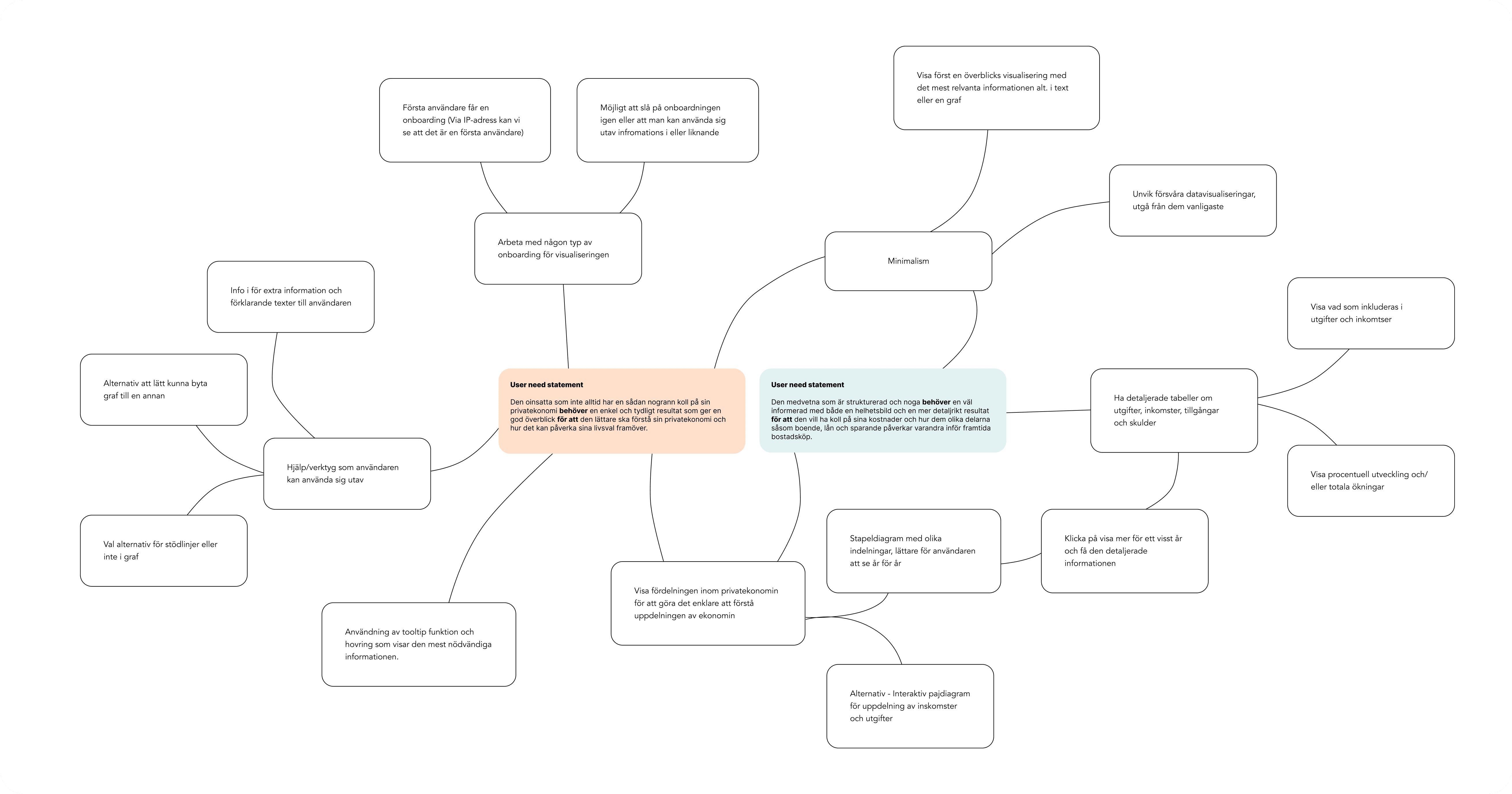
To generate insights-based solutions, we used a mind map for brainstorming. The goal was to link ideas to two types of user behavior, starting from two central user needs statements. This method provided an efficient way to explore various concepts.


Some of the ideas that were developed in the brainstorming were:

  • Diagram that is fairly common and not too complex

  • Bar chart but different divisions where it is easier to see year by year

  • Tooltip function for the most necessary information, both detailed information with tables that can be displayed if you choose to show more


Discussions were held with the UX Lead at Econans to get feedback and further start sketching on these ideas.

Sketching and low/medium fidelity wireframing

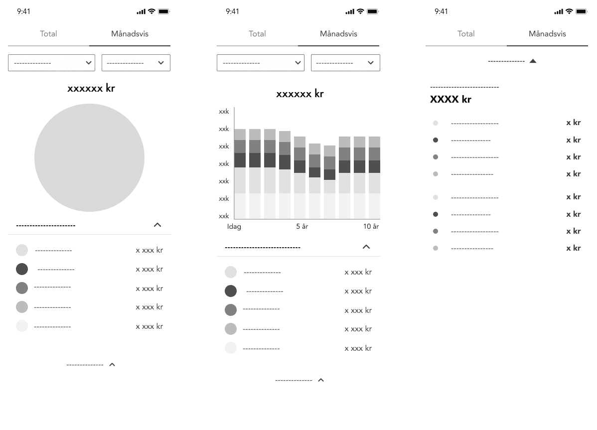
After the mind map brainstorming, it was necessary to get a more concrete concept but still the opportunity for creativity and iteration. At first lighter sketches were made on paper, mainly data visualizations and how it would relate to each other.


Furthermore, low / medium fidelity wireframes were created in the design tool Figma. There were very many different iterations, some wireframes were very easy to build while others were more and more detailed.
This phase of the design process took longer than planned, but the decision was to continue iterating and having conversations with the design team at Econans to get both feedback and input on what was created.


The interface would be designed for mobile and mobile first thinking. Therefore, this project will not be taken further for how the interface can look like on other devices, but it is something that can be done in a later stage.

Validation

Prototype

Concepts would have a more detailed interface and become an interactive prototype.

  • The data visualization took its form and needed to be presented to actual figures and present a real result.


  • The choice of data visualization is based on previous research and usability tests where the user found it difficult to hover and felt that it was difficult to follow the lines in the forecast.


  • The user should also be able to decide how far they want to see their forecast, from 3 years up to 20 years ahead.

Usability testing

When the prototype was completed I started to plan for usability tests. The usability test was to know how end users of the product experience the data visualization and the results part. The tests can identify problems, opportunities and learn more about users' behaviors.


After the usability tests I analyzed by code out the test, where it was colors that were classified in high, medium and low priority as well as positive insights. These insights were decided to be passed on to update and find solutions.

What were defined as positive insights were:
  • Bar charts feel more concrete and easier to compare

  • Experience that table as simple and structured

  • The overall experience of the result was that it feels nice, appealing and detailed.

What was defined as a high problem was:
  • Did not find the button at all or considered it to be an obscure button to toggle between liabilities and assets.

  • Did not quite understand how the different buttons where you change how long the forecast you want to see work

  • Experienced it very hard with so many clicks back and forth to see detailed information between the different years

Iterate

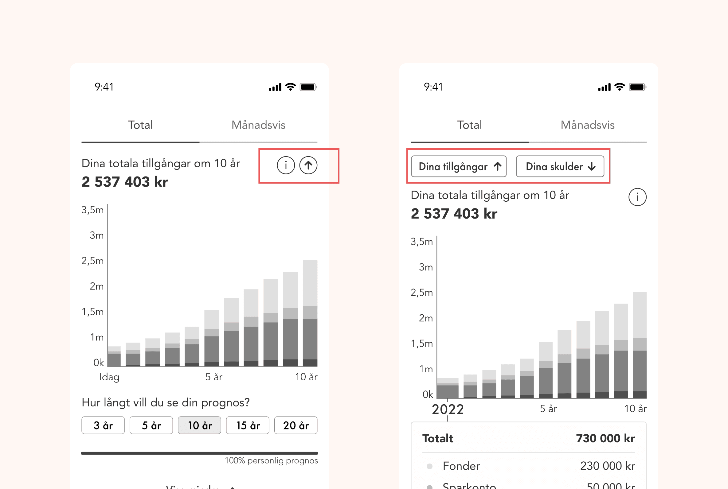
Example of iteration and improvement after usability tests.

Test subjects did not find the button at all or considered it to be an obscure button to toggle between liabilities and assets.


The buttons got clearer UX copy and a larger area above the chart than just an icon that showed an up and down arrow.

Result

After further iteration from the tests, the final result for this project emerged.
The project's goals have been achieved when a complete prototype of the results page has been created that is both useful and understandable based on the tests performed when the users have the ability to implement the interface's parts, animations and functions. Relevant data visualization has also been developed that users actually understand and can familiarize themselves with and can be used in the product's area of ​​use.

  • The prototype of the result is now designed simply with clear guidelines for where the user should click.

  • The prototype is also designed so that it is detailed with a tooltip and table that is both easy to access and get the detail that the user is looking for but also be able to see an overview without having to see the details.

  • Now it is also possible for the user to see next year via an arrow in the top corner without having to click out and in on the various bars.

  • The data visualization used in the result is a bar chart as this is one of the most common charts in Sweden. The tests also showed that the bar charts are easier to distinguish and understand compared to previous area charts and therefore these are final data visualizations that make it simple and informative.

  • The bars are also divided into different sections to show the user the distribution between the different sums. In terms of the design framework and the users' experience, this prototype and interface meet the guidelines on how Foreteller should be built up and that the users get a good experience.

  • In order to include several different components in the data visualization, it is now first divided into the tabs total and monthly. Under the total tab, the user can toggle between assets and liabilities (under the same area in the interface) and how this changes over time. Under the tab monthly, the user can see what it has left to live on (KALP) and how it changes over time.

My takeaways

This was a fun project, but due to changes in the company's orientations, Forteller has not been developed with these improvements in data visualization. However, this project has been a great advantage for another product within the company where graphs and visualizations have been part of the results page.


If I were to continue working on the project, I would likely work on the following items to improve the user experience.

  • Design a responsive prototype for tablet and desktop.

  • Conduct usability tests throughout the new flow for Foreteller 2.0 to see how users perceive the results in relation to the information they entered.

  • When and if the design is implemented, add some sort of web analytics tool such as Hotjar etc. to learn about how users are interacting with the new data visualization and result page.


Want to know more details about this project? Feel free to contact me!
emma00valfridsson@gmail.com
Gothenburg, Sweden